Creating a kitchen with a premium feel relies on skillful texture mixing. This approach adds depth and character, moving a space from flat and functional to rich and inviting. The key lies in balancing different tactile surfaces to achieve a sophisticated and cohesive result. For homeowners planning a kitchen Abu Dhabi, this technique can define a stylish and enduring interior.
Start with a Dominant Material:
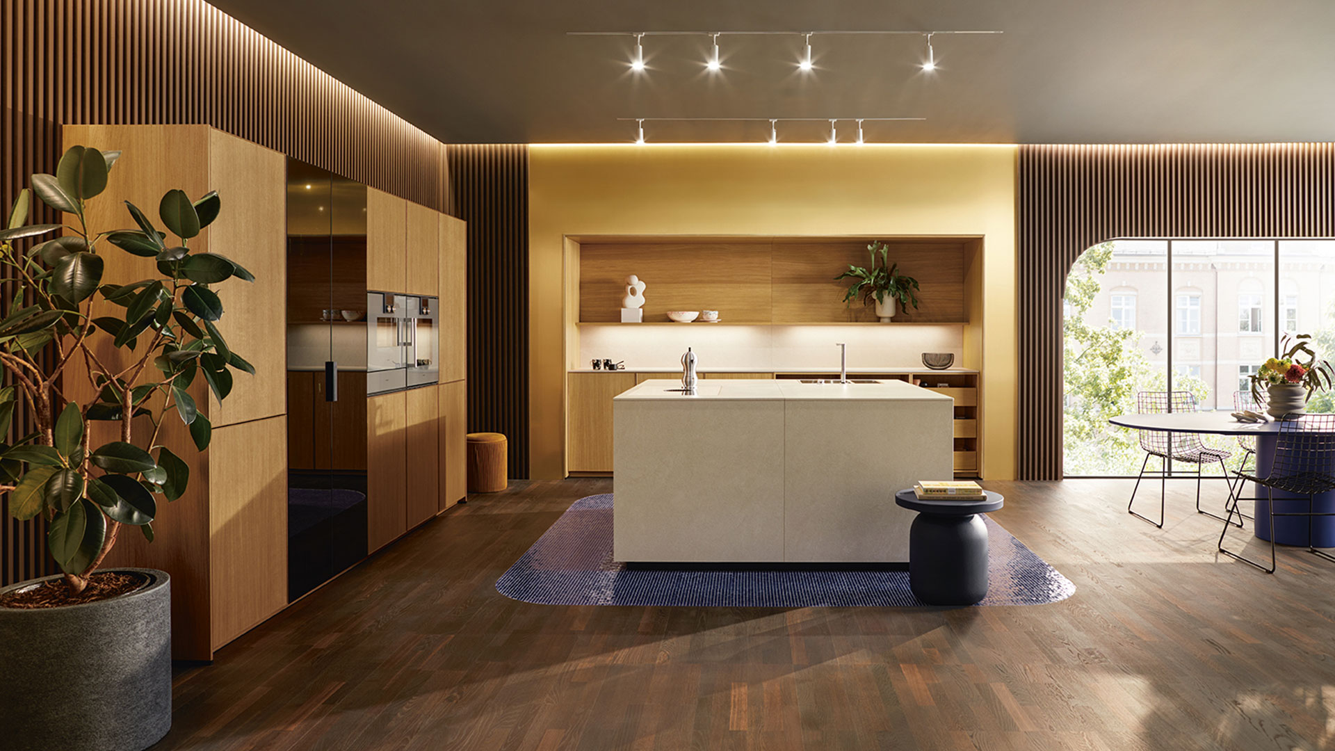
Establish a primary surface material to serve as your foundation. This could be the cabinetry finish or a major countertop material. Popular choices include smooth, matte lacquer for cabinets or a large expanse of honed marble. This dominant texture sets the overall tone clean and contemporary or soft and organic and provides a calm base for introducing contrast.
Introduce Tactile Contrast:
Once your base is set, deliberately layer in opposing textures. If you choose sleek, flat-front cabinets, pair them with a heavily veined stone countertop or a backsplash of hand-glazed zellige tiles. The smooth cabinets make the stone’s natural variation or the tile’s slight irregularities stand out. Conversely, cabinetry with a pronounced wood grain pairs well with a solid, polished quartz countertop, allowing the wood’s pattern to become a featured element.
Consider Metallic and Organic Finishes:
Hardware and fixtures offer perfect opportunities for textural punctuation. Consider the finish of taps, cabinet pulls, and light fixtures. Brushed brass or nickel adds a soft, diffuse glow, while polished chrome provides a sharp, reflective point. Do not overlook organic textures. A woven rattan bar stool, a ceramic vase, or a display of wooden cutting boards introduces warmth and prevents the kitchen from feeling sterile.
Balance Through Repetition:
A premium look requires harmony. Avoid using a texture only once. Repeat an accent material in two or three places to create a rhythm. For example, use the same metal finish on your hardware, light fixture, and faucet. If you add a natural texture like linen for window treatments, echo it with upholstered seat cushions. This repetition ties the diverse elements together.
Final Touches for Cohesion:
Maintain a restrained color palette. Let textures provide the visual interest, not competing colors. A neutral scheme of whites, grays, or earth tones allows the play of matte against gloss, rough against smooth, to take center stage. Ensure good lighting; well-placed task and ambient lights will catch the highlights and shadows of your textured surfaces, making the entire composition dynamic.